

Why Every Business Needs a Professional Website
25.05.2026
How Good Branding Builds Customer Trust all the time
25.05.2026Why Every Business Needs a Professional Website
25.05.2026How Good Branding Builds Customer Trust all the time
25.05.2026CMYK vs RGB: What Every Client Should Know
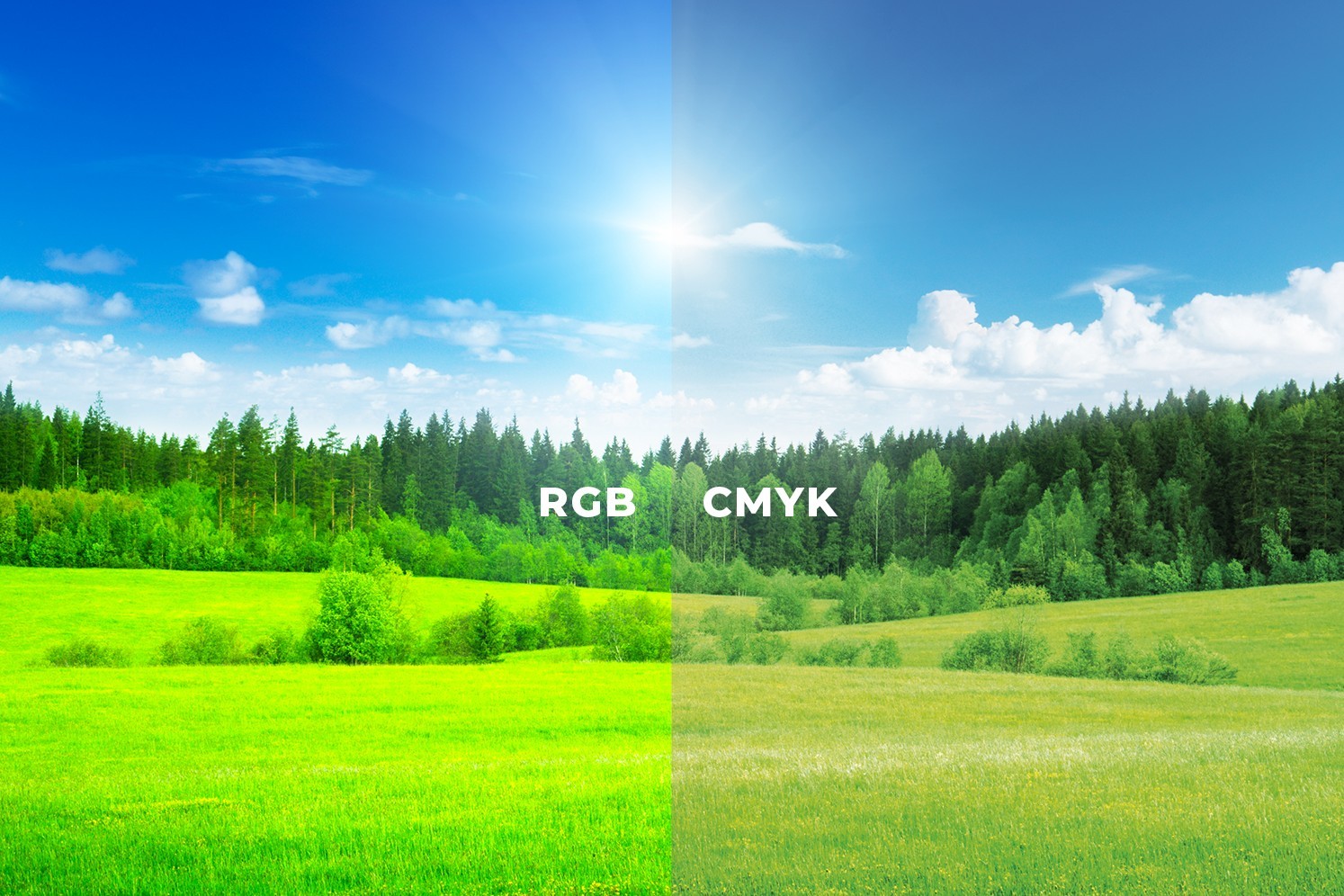
When designing artwork, colours can look different depending on whether the design is meant for screen or print. This is why understanding the difference between CMYK and RGB is important for every client who orders designs, flyers, posters, business cards, banners, social media graphics or branding materials.
Many clients expect the exact colours they see on a phone or computer screen to appear the same when printed. However, screens and printers use different colour systems. If the artwork is not prepared correctly, the final print may look dull, darker or slightly different from what was seen digitally.
What is RGB?
RGB stands for:
- Red
- Green
- Blue
RGB is used for digital screens such as:
- phones
- computers
- televisions
- tablets
- websites
- social media graphics
Screens create colours using light. Because of this, RGB colours often appear brighter and more vibrant. A design made for Facebook, Instagram, TikTok, websites or digital presentations should normally be prepared in RGB.
What is CMYK?
CMYK stands for:
- Cyan
- Magenta
- Yellow
- Key/Black
CMYK is used for printing. Printers create colours using ink or toner on paper and other materials. Since ink behaves differently from light, printed colours may not be as bright as what you see on a screen.
Flyers, business cards, brochures, posters, receipt books, banners and other printed materials should normally be prepared in CMYK.
Why Colours Look Different When Printed
A phone or laptop screen displays colours using light, while a printer uses ink. Light can produce very bright colours, especially strong blues, greens and neon shades. Some of these colours cannot be printed exactly the same way using normal CMYK printing.
This is why a design may look bright on WhatsApp or Facebook, but appear slightly toned down when printed. It does not always mean the printer is wrong. It may simply mean the artwork was created in the wrong colour mode or the chosen colour is difficult to reproduce in print.
Why This Matters for Clients
Understanding CMYK and RGB helps avoid disappointment. Before approving artwork, it is important to know where the design will be used.
If the design is for social media, website banners or digital adverts, RGB is suitable. If the design is for printing, CMYK is the better option.
This also helps designers prepare artwork correctly from the beginning and reduces issues during final production.
Common Client Mistakes
Some common mistakes include:
- sending RGB artwork for printing
- expecting neon screen colours to print exactly the same
- approving artwork only on a phone screen
- using too many similar colour tones that disappear in black and white
- designing a logo with gradients that may not reproduce well on all materials
- not asking for print-ready files
Simple Rule to Remember
RGB is for screens. CMYK is for print.
If the artwork will be viewed on a phone or computer, use RGB.
If the artwork will be printed, use CMYK.
How Creative Tycoons Helps
At Creative Tycoons, we prepare designs based on their final purpose. Whether your artwork is for digital use, printing or both, we make sure the correct colour mode, file format and layout are considered before final delivery.
This helps your brand look professional across social media, websites, business cards, flyers, banners and other marketing materials.
Key Benefits of Correct Colour Setup
- Better print results
- More accurate colours
- Fewer production mistakes
- Professional brand consistency
- Clearer artwork across different platforms
- Less confusion between screen and print appearance
Conclusion
CMYK and RGB may sound technical, but the difference is simple. RGB is for digital screens, while CMYK is for printed materials. Knowing this helps clients make better decisions and ensures that designs are prepared correctly for their intended use.
A good design is not only about how it looks on screen. It must also work properly where it will be used.